Thursday, 31 December 2015

Adobe Color CC

Colour Palette Experiments

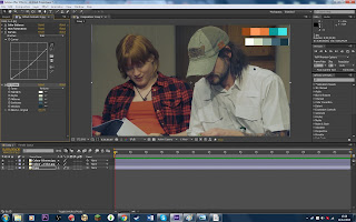
To see what colour palettes could work in my still image, I have used 'Adobe Color CC' to pick out certain colours that stand strong within the image. I want to use this colour palette to explore further with the image using After Effects.


Using the adobe colour palettes, I experimented with with the most visually striking colours that are in the photograph I took of Saltburn.


Darkened and Enhanced. Using Adobe After Effects, I have darkened and enhanced some of the colours but kept a natural look to the overall image. Bringing out the darker tones seem to have added more depth. 

Wednesday, 2 December 2015

Semiotics Theory: Denotation & Connotation

What does Connotation & Denotation mean?


Connotation is when you can have an imaginative association, either positive or negative, surrounding a word or image. Whereas, denotation, is more strict and precise to the definition or scene. I have took some images as a part of my artefact and will use one to further explain and show how connotation and denotation works within image and words.Before I explain through image, I will show an example of a word. The denotation of the word 'Lion', quoted from an online dictionary, 

'-a large tawny-coloured cat that lives in prides, found in Africa and NW India.'

This is the strict definition or said differently, a more precised description. However, if I was to personally connote this, I would use more words that would associate with the animal such as; Braveness, Courage and Dignity.


Connoting & Detonating an Image
Photographed by me


Experiments & Development: Adobe After Effects

Colour Correction in After Effects

After effects is the first program I have experimented with to show how I use colours in order to change the image that was taken. 
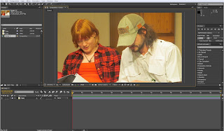
Image 1

1) Image 1 shows how the original image looks like. Looking at the before image, this image looked too orange and flat looking. The white on the male characters shirt is taking up too much attention from the image and it is where my eye was most drawn to. 

Image 2

2) Image 2 shows how I went into the effects tab and found the colour correction drop down menu. This showed us all the tools I could use to change this image. Over the entire use of this image, I use: colour balance, hues&saturation, curves and cc toner to help me with completely changing the colours.
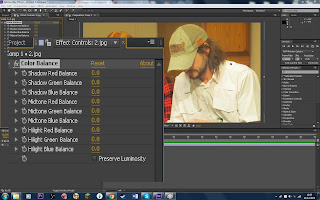

Image 3
3) Image 3 shows the colour balance setting before I changed anything. These settings controlled the additive primary colours, RGB, in shadows, mid tones and highlights to have complete control of how much colour and what colours you wanted to see.
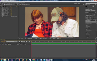

Image 4
Natural Colour Scheme
The colour balance was the main thing I changed within the natural colour scheme. I later tried changing the hue & saturation ever so slightly and then the curves to lighten and darken the image in different key areas.
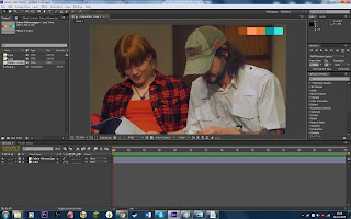
Image 5
Orange, Brown & Blue Scheme

Image 6
Blue, Grey & White Scheme
4) I have tried using two random colour palettes that I found on the web within my image using the tone. This was an experimental process to see how it colour palettes could change the image. I think that image 5 worked better because I was focused on the more contrasting colours from the character in the image. I feel like using the blue one lost its depth for this particular concept and scene.

For a final image, I think maybe creating my own colour palette for this image using what I think are the best darks, lights and midtones.


Tuesday, 1 December 2015

Research: Colour in Film

Colour Correction in Film

The best primary colours of the human eye are; red, green and blue. These colours are used, and work well, to change the colour of digital imagery. They're used to able to create all other colours.


DaVinci Resolve Three-Way Color Correction
Image from a blog, nofilmschool
In editing, we often use multiple colour wheels that have affects on different parts of the image. Using the image above to explain, the first colour wheel is lift. The lift controls the darker tones and shadows that we see, controlling the black levels. In the second colour wheel, Gamma is the next we look to control. The gamma works with the controls between the highlights and shadows called the midtones. These colours are made brighter and darker while leaving the highlights and shadows alone. Finally, the gain is used to change the brighter colours and highlights. This all helps to have complete control of the colours that we see.

Colour Schemes & Palettes 

Films do not just use any random colours, they are looked at in depth and discussed throughout the whole of the production with the director of photography. Everything is taken into consideration when working on the colour schemes. An example I will use to help explain is from a still from Pulp Fiction.


Pulp-Fiction-600x362
Image Credit to Roxy Radulescu
This colour palette shows some very strong dominant colours. It uses a lot of contrasting colours that stand out off of each other. What I think works here, is how they use the contrasting colour. We only see small amounts of the red and blue. The upper half of the shot contains a lot of darker tones whereas the lower half contains more lights.

Using the colour red can associate with fire, blood, war, energy, determination, action, love and confidence among many associations. In this image, I do think it is used to suggest a lot of confidence within the characters. There is a lot of movement in the scene and relates really well.

Using the colour blue can be associated with intelligence, loyalty, wisdom, depth, trustworthy, calming and, again, confidence. It is the opposite to red and gives the scene a nice atmosphere. 

Even in this wide shot, the characters stand out against the background. I think that the black and white costumes help to create a balance within the image and we do not see the actors getting lost withing the mise-en-scene.